 Search
 PR
PR AI Visibility
 Social

Inspired Design Approaches for PR campaigns
Searching for a new idea can be incredibly difficult. With the power of the internet, we can fine tune our projects and push them even further than before. From the research stage to the finished result, let’s go through some main key things that we think about when designing these for our campaigns. Research enough […]


Pete Campbell
Chair, Founder & Strategy Director
Share
this article
Searching for a new idea can be incredibly difficult. With the power of the internet, we can fine tune our projects and push them even further than before. From the research stage to the finished result, let’s go through some main key things that we think about when designing these for our campaigns.
Research enough to envision the final outcome
Arguably, finding inspiration for designing our campaign is the most crucial stage of the design process. When we have a great idea, the next step is to research it. The question is, how do we express the content we want to create? Should it be an infographic, website, video or any other media? This is the first thing we need to think about.
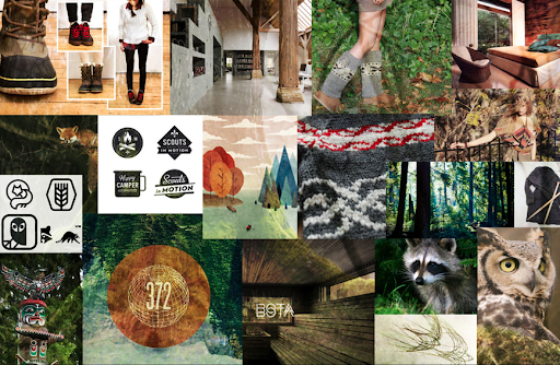
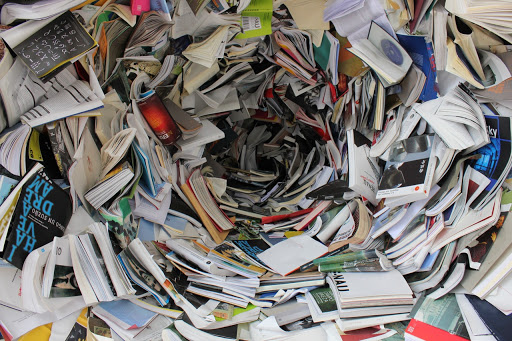
First, gather enough examples of existing work, and use them to mentally fill out what we want for the final project. One way to do this is to create a mood board by gathering a bunch of screenshots or images online. Fonts, colours, illustrations, UX design, the functionality of the website – anything that might be useful for the project we are working on. As a starting point, use a search engine to gather our mood board. We should collect the pieces we think appeal to us, primarily as a user since that’s who we aim to target as well. But we can’t just grab anything we find online. That’s where we need to research specifically for the piece. Websites such as nounproject, creativebloq and awwwards, those of which are a fantastic way to see how other people do things.
Who is our target audience?

What is the tone of voice of the piece? What is the subject matter? What is the age range we are looking at? This will help us consider how the design should look. If we aren’t following brand guidelines, then we have the freedom to change some colours and fonts, helping us set the mood and setting for our intended audience. We can’t design a serious business piece discussing the difference between profits and profit margins aimed at 7 – 12-year-olds; realistically, they probably won’t care about it.
A clearer example might be ’10 clever ways to save for your retirement’. A key point we can look at, are people who are thinking about saving for their retirement. Those people will already have a job, so at a minimum, the age range is around 16 or so. Another clue is that it’s intended for those people who haven’t already retired, so we can guess the maximum age could be 67 (In the UK), giving us our target audience as anyone between 16 – 67 years of age.
Which fonts should we use?
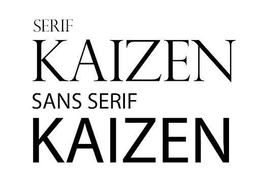
Font choice is subjective, but there are a few rules we can follow when we want other people to read it. Knowing the difference between sans serif, serif, and cursive fonts are useful, as that can help define the header titles or numbers in our infographic. Sans serif fonts are the standard of today’s choice, as they are the most readable typeface. The key to finding a good font is to see whether each letter and character can be read at any given size. The next thing to test out is whether whole sentences work, which is where we could fill out some placeholder text with the classic ‘lorem ipsum’ paragraph. This is not meant to make sense for the piece yet, but to check whether it is readable from a distant glance. Later they will be filled out with the proper copy, written by our copywriters or research team.

After we’ve chosen our fonts, create the order for how we want the reader to chronologically read it. Without an order, the piece presented will be confusing to the reader. The layout of the text should also be thought upon. We all naturally learned to read from left to right, top to bottom, whereas other languages such as Chinese, Japanese and Arabic tend to read from right to left. The question is how would we order the wording correctly for the reader? This is where the font size and weights matter, as different font weights can subconsciously make everyone read in the exact way we designed it, which they are usually the biggest and brightest. If a text is clashing with a background, then we need to add a better contrast to it. In short, make things easy to read.
However, this can be applied in a different medium such as video content. An iconic example we can look at is George Lucas’s Star Wars films, which at the beginning of every movie, he presents to the viewer a synopsis of the story with some tilted perspective, which scrolls up and eventually dissipates into space. In anticipation of the text coming from the bottom, this lets the viewer know that this is what they should read first.
What colours do we use?
Colours can help do a great number of things. Choosing the right colours can shape the mood of our campaign, from dark and gloomy colours to depict a cold and serious tone to a bright and eccentric one that fills the piece with joy and harmony. These are of course examples of two extreme cases, but what if we wanted to give off a different feel, somewhere between the middle? As there is really no right or wrong in choosing colours, this is just one way to think about how to approach this. This is where looking at some colour psychology can come in handy, as the colours can express a lot by themselves. Check out https://graf1x.com/color-psychology-emotion-meaning-poster/, which gives more of an insight into colour psychology and theory.
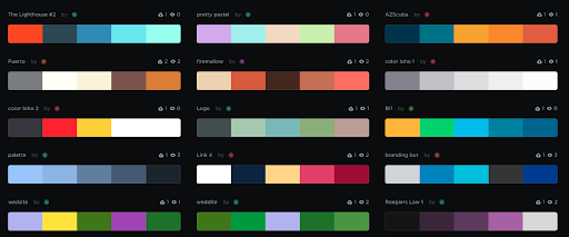
Once we know what hue we want to use, the next thing to establish is the theme. As long as you have a theme to the piece already, choosing colours will be easier. Thinking about the temperature of how ‘warm’ or ‘cold’ your content should look can also change the mood. A lot of movies do this, take horror films to be cold, with dark hues of blue and maybe something in a western setting, to show more of a red-orange tint during a tense, heated showdown at dusk. One website we tend to use quite often is coolors.co or out of the color.adobe.com. These can help us generate our colour palette, which we typically want to keep to a minimum of 4-5 throughout.
Breaking it down this way can make our decisions better of which colours should be the primary and secondary focus points or background colours.
Data Visualization

When we have a lot of information to present from our research, we need to think how we can condense all of this in an easy and digestible format. Some of the most common ways to present a huge chunk of data are bar charts/stacked bar charts, radial graphs or pie charts, scatter graphs, area graphs and line graphs. One of the most useful websites for data visualization is the Data-Driven Document(Otherwise known as D3) or look at awwwards for some other inspiration. A great book that we also recommend is ‘Information is Beautiful’ by David McCandless, which has a lot of examples to present a lot of data in a cohesive and appealing way.
Illustrations, Images and Icons
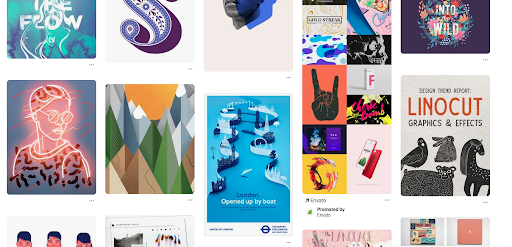
With illustrations, images and icons, once everything else above is established, this becomes the icing on the cake. Illustrations and images complement the text and ideas we are trying to communicate. We need to look at our idea objectively and come up with a way to further get our point across to the viewer. The illustrations need to have appeal, which again is widely subjective, but have a look online and see what pieces appeal to you. Pinterest.com is a great tool for looking at other designs and illustrations submitted by other people. Other websites like nounproject, mentioned earlier, is a great way to see how icons are generally designed. For free high-quality stock images, , , and unsplash are a few websites to look for some.
Here’s a summary of what to keep in mind when designing some content.
-
Research thoroughly – To a point where we can see the end result
-
Look at who we’re targeting – Think about how they are going to read it
-
Font choice and layouts – Lay them out in a chronological and readable format. Contrast it well with our colours if it’s on a coloured background or image.
-
Choose a colour theme that fits with the piece – Essentially, set the mood and tone for your audience. Colours become your contents environment.
-
Break down data with data visualization – Should you need it, have some data viz to break it into a digestible format where it’s easy to understand.
-
Illustrations, icons and images – Compliment the piece with some illustrations, images and icons if it helps add to the story and solidify your points better.
With enough time and effort, we should have a complete design for our campaign, moving onto the next one. Hopefully, this has helped some of you out there who needs a bit of guidance on how to create inspired led content.
 Substack
Has AI Killed International SEO?
 Substack
What Working in Three Languages Taught Me About SEO
 Free Resource
LLM Visibility Discovery Session
 Free Resource
How to Build a TikTok SEO Strategy – Webinar Recording
 Substack
Why Reactive SEO Breaks Down
 Free Resource
How to Build a TikTok SEO Strategy
 Substack
Why Reddit is a Goldmine For Human-Led Campaign Thinking
 Free Resource
TikTok SEO Discovery Session
 Free Resource
How to Measure & Optimise LLM Performance
 Free Resource
The TikTok Shop Playbook for eCommerce Brands
 Free Resource
How to Scale LLM Traffic & Visibility
 Substack
From Managers to Multipliers: How Automation Changes the SEO Leadership Role
 Free Resource
How to Navigate the Search-Verse™
 Free Resource
Search-Verse™ Ranking Factors
 Free Resource
How TikTok Shop is Redefining Search & Shopping


